 Untitled (For The Sun) - This project presents a new way of viewing time. An electronic display, whose numbers vary from 0.000 to 99.999, counts the percentage of the day that has passed, recieving this information from a light sensor at the top of a building. The most interesting aspect of this piece is that, depending on the time of the year, "time" will run differently, because the work "displays 'sun time' and not 'clock time'."
Monday, May 4, 2009
Jim Campbell
Untitled (For The Sun) - This project presents a new way of viewing time. An electronic display, whose numbers vary from 0.000 to 99.999, counts the percentage of the day that has passed, recieving this information from a light sensor at the top of a building. The most interesting aspect of this piece is that, depending on the time of the year, "time" will run differently, because the work "displays 'sun time' and not 'clock time'."
John Haddock
Internet Sex Photos- This project doesn't have much of a description, just "P0rnography, with the people removed." It is really crazy how different these photos must seem than the original one's, now that the main focus has been removed. The photos inherit a completely new identity, composed of the scenery that once was in the background... way in the background.
Daniel Shiffman

Reactive- Also called "Super Happy Particles," Daniel Schiffman's piece explores the way a digital image can behave. A video camera records a viewer's movements and translates this movements into an interactive world of exploding particles. He says that he developed the program in C.
Tuesday, April 28, 2009
Art 21
Sally Mann- I like her use of "ambiguity in art." When a work is less straightforward, that presents an opportunity for the viewer (and the artist, too) to spend more time with the piece and to gain a stronger connection with it. She says that art sometimes doesn't need some profound meaning; I agree with this.
Mel Chin- "Art in the 21st century is the same as it's always been; it is never the same." This is a very interesting, and also very true statement. Art is always evolving, and if it wasn't then we would surely lose interest in it. I like his art of "restoration."
James Turrell- His works with light are fascinating to me. He says that we use light, but often don't think of just light. I would love to go into the light hallway that he constructed, it seems like it would be an amazing thing to see. His level of investment in his work is astounding, costing him 2 marriages and a relationship; not many people have that sort of dedication to anything, but it must be so rewarding for him. I feel as if becoming part of the art makes the experience stronger.
Gabriel Orozco- He says that he doesn't use a studio because a studio is isolated, like a bubble which separates you from reality. This is an interesting point, and I admire how dedicated he is to keeping with reality and becoming intimate with his work. I thought that all of his work that was shown in the video was incredible and I really like the perspective he has on his pieces.
Friday, March 13, 2009
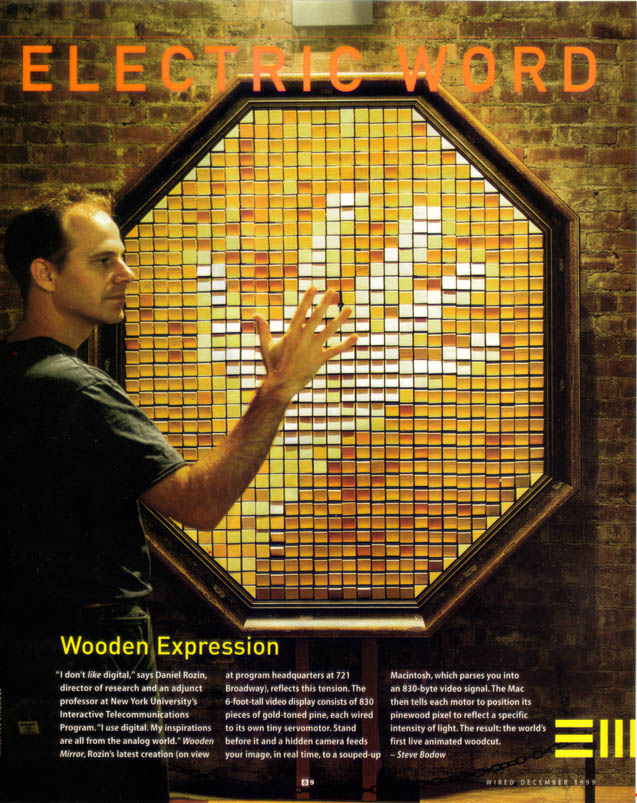
Daniel Rozin- Wooden mirrors
 "This piece explores the line between digital and physical"
The wooden mirrors that Daniel Rozin created seem impossible at first; a viewer stands in front of the piece and their image becomes reflected on a generally non-reflective surface. The pieces, not all made out of wood, use hundreds of tiny rotating squares that spin according to a computer program receiving information from a tiny camera. The tiny squares then function as pixels to create the image. I am not sure exactly how the squares change color; it could be with carefully engineered shadows, or perhaps each one has several sides with different shades. Either way, this is unlike anything I have ever seen before.
Jon Haddock- RGB Grid
 Jon Haddock's work with the RGB grid is a really cool concept. Basically, he takes an image and takes each pixel and changes to it's literal RBG value, which can range from 0 to 255. What's really interesting is that with each value spelled out, an image still comes out, since the numbers themselves actually vary in their size. You can see the result above, the source being the cover of Disney's "The Air Pirates." It's a clever process that I think is definitely worth taking a look at.
Thursday, March 12, 2009
Thoughts on Digital Pictionary
I liked how this project worked out. It was thought provoking and interactive and just fun in general. I really enjoyed it for several reasons, the first being that it was done pretty much all in photoshop. I'm am not even close to knowing the ins and outs of photoshop, but I do have a lot of experience using it and other imaging software for many projects, so this was cool to use it in another way. I've always enjoyed doing photo-manipulations, but they have almost always been more for fun rather than a specific purpose. Where my original intention usually gets warped and twisted to come out completely different in it's meaning, this project forced me to stick to a definite plan: express my word.
When I first got my word, I was a little overwhelmed. I wasn't sure how I was going to be able to communicate "bold" effectively to the class. I thought about it and started getting ideas. As I did, I became a little more comfortable and realized that I didn't need to make everybody absolutely "get it," but rather express it somehow. I think that I did this effectively. I wanted to put in a few literal examples of the word bold, but more so I wanted to communicate the feeling. I think I did both of these effectively.
I thought it was interesting that Adam interpreted my word as "danger" or something similar. I didn't really have that in mind at all when creating the images, but now that I think about it, I can see a possible "danger" theme running through all my images. What I like about that assertion is that even though the images could be interpreted as danger, the way that the message is communicated is through use of "boldness." The hand communicates danger or "stop" because it is bold. Mozart's expression looks scary or intense possibly because of the bold contrast in his face. The meteorite stands out and is glowing red. Obviously it is potentially dangerous, but what really accentuates it's level of intensity is how it stands out against the black-and-white (and mostly boring) town in the background. Also he said at the beginning that there wasn't much going, at least initially; I'm glad he mentioned this, because I knew from the start I didn't want my images to be too busy. If there were too many things going on at once, it would be more difficult to make a single image really stand out.
I was also happy when somebody commented that all of images fit together really well and worked as scenes. That was a big thing I wanted to go for. It wasn't absolutely crucial for the meaning of the work, but I did want my images to have at least a somewhat polished look to them. I feel proud of how all my images turned out.
As for everyone else's projects, I enjoyed picking apart and analyzing their work just about as much as I enjoyed working on mine. I made sure to look at each picture and maybe take a few stabs at what the word could be, but I didn't really delve too deep into analyzing any of the images except for mine. I wish I had looked more closely at each one before the discussion, because I feel like finding out things about an image for yourself is a lot more enjoyable than having them described to you.
My favorite sets were Mike Virga's and Jackson's. I think that they communicated their meaning very well without blatantly expressing their literal meanings. It might be that the nature of the word dictates somewhat how it could be presented- some words of the words are inherently literal while others are inherently abstract- but I think that they had a clear vision of what they wanted to do when they started instead of just making it up along the way. If they didn't know exactly what they wanted to put into the collages, then I think that they at least had a clear sense of their words and their meanings and connotations.
What I like about Mike's pictures, especially the first one, is the sense of a story. Even in the last one, where a lot of the images are unrelated in their content, everything was coherent; The images flow and fit together nicely.
Jackson's collages are great because, like Pat mentioned, they convey a clear sense of a message. Although the actual meaning may be hidden somewhat, there is without a doubt something being said. The fact that the viewer has to dig into the work is not a bad thing- in fact I think it ultimately makes te message more effective. If he had just put up the declaration of independence or something kind of obvious like that, then, sure, the viewer would "get" it more quickly, but probably wouldn't care about it a whole lot. With these images, the time spent analyzing and picking apart the work builds more of an emotional connection to the content, thus making the image, ultimately, more effective. I also really liked, in the third collage, how the figures holding hands and Che's face were used as a mask for the background image.
Looking at some of the other works, I prefer the ones that aren't so literal and obvious. A lot of people just took a bunch of images that define, or are definitions, of their word and kind of threw them together. Some of them, like inorganic, are kind of forced to do this, but I think some of the other one's could have done more to really convey a meaning. One of the sets that shows a lot of literal images, yet manages to use the word in it's overall composition and form is Michelle's. In the top one, all of the images are pretty much obtuse shapes, but I like how they mostly all interact with each other and form a bit of a bigger picture. I also thought it was really cool how in the second one, she used a different meaning of "obtuse," as in something that is unclear. I didn't know of the meaning for obtuse, but when I first saw the picture, one of my first thoughts was something along the lines of "most of this one is really unclear."
I am interested how Sam's collages get analyzed. I know her word, so I can see how all of her images work well, but to someone who doesn't know the word, a lot of different things could be being communicated.
I am also excited to see Koko's work get presented. I used to know her word, but I forgot it and can't figure it out. I read Allison's analysis and she takes a guess that the word might be "uniqueness," which I think is a good guess. They seem very expressive of something, like Jackson's collages, but I can't quite put my finger on it. Either way, I really like them.
Overall, this was a really fun project. I hope that we have more projects similar to this. Not similar really in what we actually make, but similar in the process. I really liked being able to get inside my classmate's heads and see how they interpret things similarly yet also in a unique way.
Scrapbook 12

I took this picture not too long ago, when one of the little rivers that branches off from the St. Mary's River was still covered in ice. I was out taking pictures and I saw these three boats that were all ashore, stuck in the ice. It seemed really interesting and almost funny in a way that these boats, meant to traverse the water, were now trapped by the river's current state.
Scrapbook 11

 The first image I took a while ago when me and my friends went to junkyard to go get some seatbelts that we could make into things like belts and backpack straps. I was amazed by the amount of damage that some of the cars had sustained, and while I'm sure a substantial amount of damage came from the actual process of being in a junkyard, I can't imaging that a lot of the accidents that these cars were in could have been pleasant. The second one is from when my car got totaled on my way home for thanksgiving break. I think the two images fit together.
Cars are something that we take for granted most of the time, at least when we have them. They, like so many other things, become a crucial part of our lives and we usually don't realize this until we, for one reason or another, have to get along without them. They are also, obviously, really dangerous, yet we depend on them so much that we are are willing to take the risk of either driving them or being in them. After a while, it is easy to forget that you're actually speeding down the highway in a giant hunk of metal at eighty (ninety, one hundred?) miles an hour surrounded by may people doing the same who may or may not have a clue what they are doing.
Scrapbook 10
 I took this one at Henryton, an abandoned insane asylum (I'm skeptical to call it that; "insane asylum" seems to be used to often only for it's shock value. Maybe I should call it just a mental hospital), which is, not surprisingly, a great place to take pictures. The halls are dark, the paint everywhere is peeling, mirrors are broken, beds are strewn across the rooms. None of it is art (except for maybe the graffiti everywhere), but it's all very cool to experience.
Scrapbook 9

This was out in a small field with some old farmhouses and other decrepit structures that me and some friends were filming a movie in. I thought that some of the buildings looked really awesome, so after filming stopped, I ran to my car to get my camera and took a bunch of photos. Old things are, in general, really cool.
Scrapbook 8

These were three little branches protruding from a tree in my backyard that had been attempted, on numerous occasions, to be cut down. I thought that these tiny branches looked neat, almost like tiny tree people living on a stump. I don't really have a whole lot tmore to say about them, but they caught my eye.
Scrapbook 7

During numerous ventures through the woods, my friends and I came across a clearing with a bunch of power lines inside. On one the structures, this sign was hanging. I think it's funny that this sign, obviously meant to keep people off, was hanging upside down by a flimsy piece of metal, and also, that it was beat up and had a lot of holes (bullet holes?) in it. Obviously we climbed the crap out of the tower. Not the whole thing, just a little bit. But still.
Scrapbook 6
 This picture is from the church that is near the car I featured for another scrapbook post. It's also near the power towers that are in a later scrapbook post. A lot of outer walls and doorways are still somewhat intact, but there is no roof or anything. It is a cool place to go and think, if you're willing to make the hike to get there. There was, I don't know if there still is, a small journal in a plastic box for people to either write in or stamp (letterboxing.org). It's neat to imagine what the place might have been like when it was built.
Scrapbook 5

This car, along with like five others, was just sitting in the woods that my friends and I were out exploring. We had no idea why a bunch of old rusty cars were just sitting there in the middle of the woods, but there is a really old ruinous church not too far up a hill nearby. We found out that there used to be some kind of roadway in the area, but everything got washed away in a hurricane or some kind of nasty storm. I just looked up hurricanes that happened in the Maryland area, and I think it may have been the Great Atlantic Hurricane of 1944.
Scrapbook 4
 Cigarettes are really weird/interesting. So many people choose to smoke when it is obviously so unhealthy. I'm not saying smokers are bad or anything like that, I've smoked a few myself, but I don't think there is any overwhelming evidence, even from any conspiracy theorists, that smoking is good for you. So why do so many people do it? Because it's cool? Addiction? Just because? I don't think the answer is simple. I know many smokers who acknowledge smoking's harmful effects, yet have no desire to quit. They shrug it off with something like "If I want to die young, let me." This seems more like being unwilling, or even afraid, to admit that they need to stop. But who am I to say?
Sunday, March 1, 2009
After Life
The whole concept of After Life is really interesting. I thought it was cool how used a seemingly "real world" setting to present the after life as opposed to trying to make it seem heavenly or something of the sort.
I most liked the character who decided not to choose a memory; I think he said something along the lines of "creating a future would be more meaningful than living in the past." This made me question the whole memory re-creation process. For one, I don't think that any of the memories could be accurate because our memories get so skewed and idealized over time. I think about how two people can argue over something that happened years ago because they both believe that it happened their way and the others. Even if the memories could be recreated perfectly, the memories still wouldn't match the moment.
I also think that I wouldn't want to live in a single memory, even if it was a great one. It may be a happy moment, but it seems like being trapped in a cage that you can't leave.
Another character that I was really drawn to was the man ( I believe his name was Wanatabe) who had a difficult time choosing his memory. He says he had many great memories "of course," but couldn't remember any. I felt sorry for him because he said his life hadn't gone as planned. In the videos when he was younger, he was so enthusiastic to leave evidence of his life and not lead a so-so life, but a so-so life is exactly what he led.
Overall, I thought the movie was good. There were elements that I didn't quite agree with, but that isn't a reason for me not to like the movie, it's just another perspective to think about.
Sunday, February 22, 2009
20 lions
The project was really interesting. It definitely made me pay attention to a lot of things that I probably wouldn't have on another piece of art. Because we were so restrained in our tools, every little detail that might be ignored in a larger-scale artwork took on a huge role in the line's "meaning." I tried to give each of my lines a distinctive personality; some were shy, others were loud and obnoxious, and others were excited. The first few lines I drew did not really have these personalities, but rather were drawn to look cool. As I drew more, I realized that my lines all looked kind of the same and had no meaning to them. So I started over and attempted to give each one a life of it's own. It was fairly easy at first, but as I continued, it became more difficult to make each one different.
The 20 lines changed my perspective on detail and meaning, and I think that it will help me pay more attention to these things in the future. Seeing others' projects was also really interesting. I think the most interesting were the ones who took the project in a completely different direction than I did yet still put meaning into the work.
The 20 lines changed my perspective on detail and meaning, and I think that it will help me pay more attention to these things in the future. Seeing others' projects was also really interesting. I think the most interesting were the ones who took the project in a completely different direction than I did yet still put meaning into the work.
Tuesday, February 17, 2009
Scrapbook 3
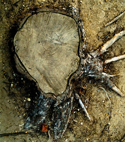
I didn't really notice this tree stump until one day when I was out unicycling (don't judge me) and saw it as something to ride over. After that, I realized that all of the tree roots and stumps coming out of the ground were actually really cool looking. I am not sure why this tree was cut down, but I feel like the stump remains almost a part of nature's defiance and unwillingness to just go away. Completely remving the tree would have cost a lot of time and money, not to mention how much it would disturb the surrounding area, so they just left it as a stump.
It seems like it was a nice tree, a friendly kind of tree that would be easy to talk to and wouldn't judge you. Maybe that's kind of weird, but I think that it is interesting to think about what the area was like before this tree and another one nearby were cut down. A tree has an effect on it's surroundings, but this effect might not be too noticable until the tree is cut down.
Google Earth
Thursday, February 12, 2009
Scapbook 2
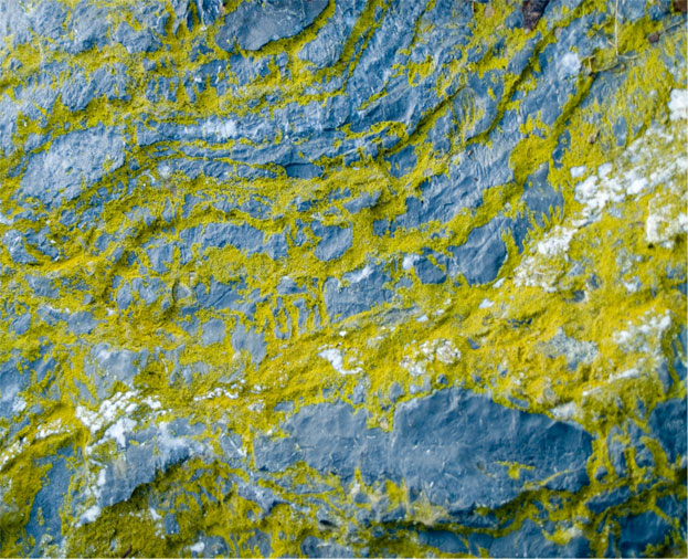
People don't generally pay attention to rocks. They aren't the most interesting or unusual things that we encounter in our daily lives, so it makes sense that they should go mostly unnoticed. However, like most things, rocks can be truly fascinating upon a closer inspection. Rocks by the water are especially interesting, like this one here, which I saw while taking pictures by the river. I probably wouldn't have noticed it if I weren't consciously trying to find things that I wouldn't usually notice.
The bold contrast between the rock and the moss is what caught my eye, and unless somebody placed the moss on the rock by hand, then I think it is safe to assume that this is probably not art.
Google Earth
Wednesday, February 11, 2009
Growing Up Online
The Frontline documentary was interesting, to say the least. I did not like how it seemed to propose such a negative view to the internet world, making those who use it regularly seem like they would be basically useless without it. Perhaps this is true, but I feel like a lot of the documentary was a bit "sensational" at times.
1) Before Facebook and MySpace, how do you think 'social networking' differed from today?
I am not sure the exact definition of "social networking," but it seems to me to act like a social web which we use to interact with one another, where the actual medium of the web varies. I think before Facebook and MySpace, social networking probably took place between much smaller groups of people. With the internet, it is extremely simple to be able to communicate with a large number of people at once. Before the internet, it was surely not so easy to be able to connect with such a large number.
2) In your own words, how would you describe something like Facebook to:
a) your friends (pretend they've never seen it!)
b) your parents
c) a grandparent
d) a teenager living in 1950
This is an interesting question. I feel like for a, b, and c I would give a similar answer; that Facebook provides a way to communicate and interact over the internet. Given that all three of the groups know how to use the internet (they actually use facebook, too), I don't think this would be too difficult to comprehend. As for the 50's teenager, I am not sure how I would describe it. I guess I would try to relate a computer to a television, but rather one that you control. Facebook then, would be a means to communicate with other friends' "televisions."
3)Find a random person on facebok.
I found Jack P.
I think thing to note about this guy is that he hasn't given out a whole lot of information about himself. He doesn't give his full name or any photos of himself. He does, however, give his birthday, where he goes to school, and his hometown. He listens to mostly rock and likes video games. It's interesting that his only two pictures are on that says "Jack" and another of a chloroform bottle.
The design of the page is pretty basic and doesn't do much to reveal anything about Jack P. I wouldn't really want to add this person as a friend or find more info on him. It doesn't seem like we have a lot in common and he doesn't seem like a terribly interesting person.
4)Does Facebook compartmentalize?
I think that Facebook definitely compartmentalizes the way we broadcast our info, but I don't necessarily think that this is a bad thing.
5)The medium is the message.
With facebook, we seem to be saying that we need to be in constant communication with one another, and also that privacy is not a big deal (or maybe that we don't quite understand it). While our entire lives might not be contained within facebook, we certainly give enough information about ourselves for strangers to find out things about us that we probably shouldn't want them to know, but apparently we don't care too much.
Sunday, February 8, 2009
Scrapbook 1

I found this bottle not too long ago when I ventured out to take pictures. It was on one of the small beaches on the side of Route 5 and thought it was so intriguing; somebody just threw away this bottle and the earth transformed it into something different. I think it shows an example of the earth's resilience. I took the picture just a little before the scrapbook project started, so the picture itself is somewhat intended to be art, but the bottle itself definitely isn't. It's just a bottle that somebody threw out.
Google Earth
Tuesday, February 3, 2009
in other news...
I thought it was really cool that we all have our own web space and I've been thinking lately about how I would like to get a website back up and running (I had one called thesitewiththestuff.com for four or five years but I stopped paying for it so it vanished into cyber-limbo) so I spent a few hours making a small online portfolio-type thing. Once I have enough money, I want to buy a domain for it. Maybe nickhughes.net or something.
anyways, every time you visit the page, the photo randomly changes, giving it a little variety.
ALSO, making the site made me realize how weird the word "sight" looks. Or at least it looked really strange to me for around 10 seconds.
anyways, every time you visit the page, the photo randomly changes, giving it a little variety.
ALSO, making the site made me realize how weird the word "sight" looks. Or at least it looked really strange to me for around 10 seconds.
What is the purpose of art?
It is interesting that something so seemingly universal as art can be so difficult to define. Einstein considered his theories to be great works of art, but could this really be true? I think so. It seems to me that at its very core, the purpose of art is to express something. Be it complex or simple, common or absurd, an expression of any sort could probably be considered art. I think that Einstein considered his theories to be art because to him, behind the complex mass of numbers and equations, the elegance of the universe is revealed. I suppose another way of putting it would be to say that the purpose of art is to present a way to look at our world. Or another world, for that matter. I know that my answer doesn’t offer any profound insight, but I don’t really have any deep insight to offer. I do like how Januszczak puts it: “its job is to change your weather.” But maybe art actually is a cat like Saltz says.
Thursday, January 29, 2009
Art21
The Art21 videos were very intriguing to me; it was definitely cool to have the artists give their perspectives and reasoning behind their works. It was nice being able to identify with a lot of the things that the artists said.
Vija Celmins-
I was impressed by the approach Celmins takes to her art. Rather than just painting a painting, she builds a painting. Instead of using symbols, she says she lets images just flow through her life. Her description of how images can hold memories really stuck with me as well. That images can hold memories is not exactly a secret, but something about the way she said it really impressed me. As for her actual art, I thought that the painting of the stars was really cool and had a lot of depth to it. I also loved the ocean images, partially because of her story behind them about her going to the ocean every day in hopes of something amazing appearing.
Elizabeth Murray-
I think I was able to identify most with the things that Murray said. Her description of an artist being like a safe breaker seems so accurate to me. Sometimes you need to really wait for something to work. You need to keep trying new combinations in order to find that right one. Her description of how she can love a piece of her art one day and hate it the next morning I think is something that any artist can identify with. This also ties in with how she said how you can't always be on straight path with art, how sometimes the road has curves in it and even other times you get off the road completely was somehow comforting to hear. All artists go through rough times. I also really liked her claim that painting is physical. I just think the idea of someones whole body going into a work of art is really awesome and I really want to start getting more physical with my art, rather than just sitting behind a computer.
Ann Hamilton-
Ann Hamilton's art was really interesting to me. Her project in the house with the fuchsia powder running down the walls was something that really struck me. I also thought that the pinhole camera that she put in her mouth is such a fascinating yet simple concept. The project she said up in the abandoned warehouse was also really cool.
Bruce Nauman-
Some of Nauman's works didn't really grab me, but I did find some of his projects very cool. The bleachers that didn't seem to serve any purpose grabbed my attention. The stairway through the field was also interesting. I like his statement that the stairway's "intention" is what makes it art. Another thing that struck me was one of the first things he said. It was something along the lines of that he doesn't have a large audience in mind when he creates his works, he thinks more along the lines of what he might show a certain person. I like this approach because it's impossible to please everybody all the all time and it seems like if you are creating a piece of art with the intention of satisfying as many people as possible that you may also have to sacrifice your vision of the artwork you intend to create.
Matthew Barney-
It was somewhat difficult for me to really grasp Barney's work, I think because he works with film and there were only a few clips shown so I couldn't really find the "essence" of whatever he was trying to express. The Cremaster series seems interesting enough, and I was impressed by the level of thought and detail that seems to go into his work. I think it was his father that saidwhen Barney has goal he will find a way to make it work. It should seem obvious to most people that if you have a goal, you should do what it takes to achieve it, but I don't think this is put to practice nearly as much as it should be. There have been a few projects that I can remember seeing so vividly in my head, but that I never managed to complete because I thought that they might be too difficult or too much work.
Tuesday, January 27, 2009
"Reading Images"
The project we did today in class was very cool. I really enjoyed trying to delve deeper into the meaning of the images and trying to find a connection between them all. Even though it was somewhat difficult for me to draw conclusions about my group's images, it was fun to do and I think that I will get better at this sort thing with practice. Hearing the other groups' interpretations of their own image sets was also very interesting and really made me think about the images and change my perspective. Not only was reading the images exciting, but just the images themselves were quite interesting.
Sunday, January 25, 2009
Alexei Shulgin

Alexei Shulgin has taken an interesting approach to music with his so-called "cyberpunk rock band," 386 DX. One who might happen to wander into one of his shows would probably be pretty surprised by the experience. Alexei, armed with a computer keyboard connected to a 386 DX processor running MIDI software on Windows 3.1, would take the stage and perform computer generated MIDI replications of popular songs along with a visualization of the song projected onto the screen behind him.
Alexei's music sounds like a combination of old video game music paired with one of those text-to-speech programs. It is an interesting listening experience, but I can't imagine that many people would ever say "man, I could really rock out to some Alexei Shulgin." It seems that he takes a lighthearted approach to his performances, perhaps poking fun at the over-serious state of modern music. It is very cool that he does all this with a computer running on 4 Mb of RAM and 40Mb of hard drive space. Watching his performances should make us question our perspective of how we view music and what we consider music and, less specifically, art in general. It is interesting to note that in the video below, he is wearing a shirt that says "NOT AN ARTIST."
His work reminds of an artist that I enjoy listening to every once in a while called "8 Bit Weapon," which use a Commodore 64, Nintendo equipment, and some other simple synthesizers to make a really interesting combination of old video game sounds and modern music. While 8 bit weapon may use slightly more sophisticated equipment, they have created some really cool music. They have a few albums available for free download on their page that I linked to above, and also have a few songs available to stream on their myspace page.
What intrigues me most about these tpes of artists is that, while their "creations" may not be as accessible as more conventional standards of art and music, they show that it is definitely possible to break away from the norm and create something new and unique.
(http://www.easylife.org/386dx/386dx-in-2001.mpg if the embedded video won't play.)
Thursday, January 22, 2009

Subscribe to:
Posts (Atom)